Paper: Li, J. et al. (2022) “Hiplot: a comprehensive and easy-to-use web service for boosting publication-ready biomedical data visualization”, Briefings in Bioinformatics, 23(4), p. bbac261. Available at: https://doi.org/10.1093/bib/bbac261.
Biomedical research today is defined by data. Modern studies in genomics, transcriptomics, proteomics, and clinical science generate information at a scale that is difficult to manage with traditional desktop tools. In that setting, cloud based applications have become an important part of the research workflow. Hiplot, published in Briefings in Bioinformatics in 2022, is a paper that illustrates this nicely.
What is Hiplot?
Hiplot is a web based platform for biomedical data visualization. In plain terms, it lets researchers upload tabular data and generate publication-ready graphics (heatmaps, boxplots, survival curves, pathway enrichment plots) without requiring users to write analysis code for most visualization tasks. It currently offers over 240 visualization plugins covering basic statistics, multi omics data, and clinical models.
What makes it interesting from a cloud computing perspective is not just that it runs online, but why it was built that way and what specific problems that solves.
The problem it was solving
Before Hiplot, researchers had a few options: commercial desktop software like GraphPad, programming in R or Python, or existing web tools. The web tools that existed were either too narrow (one platform had only 16 visualization functions) or too focused on upstream pipeline tasks like sequence alignment, with little support for the final step of actually generating figures. None of them let you edit your data in a spreadsheet directly in the browser. Reproducing a figure from a previous session was often painful.
These are real friction points. In practice, figures get revised constantly throughout a project. If regenerating a plot means re-running a local script, debugging a broken environment, or navigating a slow interface, that friction adds up quickly.
The cloud aspect
Running on the cloud means the platform lives on remote servers maintained by the Hiplot team, not on the user’s own computer. Researchers connect through a browser, send their data, and get results back. The actual computation happens elsewhere. That alone removes a significant barrier: no installation, no dependency management, no worrying about whether the operating system is compatible.
But what makes Hiplot a more interesting cloud example than just “it runs online” is how it handles the back end. When a task is submitted, the data is encoded and sent to a server where pre loaded R environments are waiting, with software dependencies already running in memory and ready to process the request. That is why basic plots come back in seconds rather than having to wait for an environment to spin up from scratch. The platform also has a command line tool that talks to the same back end, useful for researchers who want to automate batch processing without leaving the terminal.
Reproducibility is handled by saving each task as a portable JSON file recording the data, parameters, and output path. It can be reloaded later to get the exact same figure, in the browser or from the command line. For research, where being able to retrace every step matters, that is a thoughtful design choice.
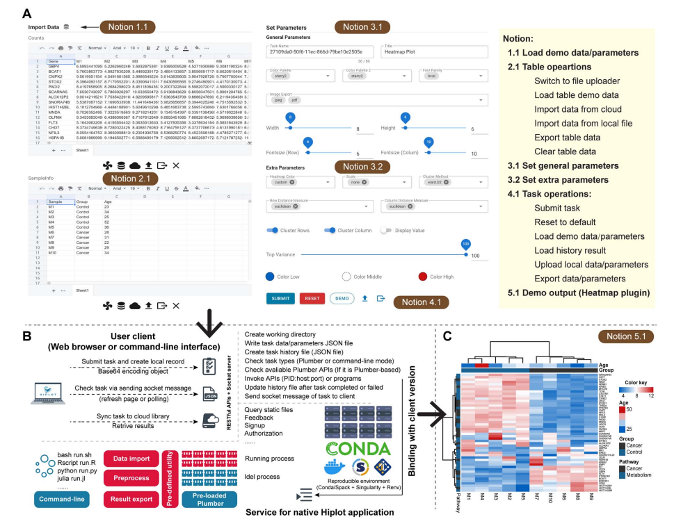 The heatmap plugin workflow: from data import and parameter setup in the browser (A), through the back end task processing pipeline (B), to the final publication ready output (C). It gives a good sense of how the full cycle (upload, configure, compute, retrieve) works in practice.
The biomedical value
The visualization categories in Hiplot map directly onto the kinds of questions that come up in biomedical research:
| Module | Example visualizations |
|---|---|
| Basic statistics | Boxplots, heatmaps, correlation matrices |
| Omics | Cancer genomic landscapes, gene fusions, pathway enrichment, dimensionality reduction |
| Clinical models | Survival curves, nomograms, Cox regression outputs |
What I found most interesting is the clinical models section. Tools like survival curves and nomograms are standard in clinical research but rarely included in platforms aimed at bioinformaticians. Including them suggests Hiplot was designed with a genuinely mixed audience in mind: not just computational biologists, but also clinicians and researchers who work closer to the patient data.
Final thoughts
Hiplot is a good example of how cloud tools can serve scientific work in a practical way. It is not trying to replace statistical analysis or programming workflows. It sits at a specific point in the research process, after the data has been processed and before the manuscript is written, and makes that step faster and more accessible.
Usage: Over 2.5 million visits from 100 countries by the end of 2021.
It is a useful case study precisely because it is not flashy. It shows how thoughtful infrastructure decisions can have a direct impact on how researchers actually work day to day.